Aware Management Interface
A management application for zoos to help them use and track scientific principles in the care of their animal populations.
Our Client
AWARE Institute is an independent consulting organization with the mission of supporting advancements in animal welfare through assessment, research, and education.
AWARE Institute is an independent consulting organization with the mission of supporting advancements in animal welfare through assessment, research, and education. They are a group of Phds in animal behavior that consult with zoos and research organizations on how to best care for and enrich the lives of animals in captivity.
Aware founded the Elephant Welfare Initiative (EWI) following the completion of a large-scale North American elephant welfare study (see http://collections.plos.org/elephant-welfare), which demonstrated that daily practices such as social management, enrichment and exercise play a critical role in improving the welfare of zoo elephants.
Based upon the outcome of this study, Aware developed a set of metrics and methodologies to assist zoo and research organizations in improving the livelihood and care of their animals.
My Role
I was the sole UI designer and front-end developer on this project...
At Vistalogic we had a very small but agile team. I was the sole UI designer and front-end developer on this project, working together with the client and our developers to shape Aware Institute's vision into a successful and compelling software product.
The Challenge
Aware had a vision of a management application for zoos to help them track and use scientific principles in the care of their animals.
Aware had a vision of a management application for zoos to help them track and use scientific principles in the care of their animals, based on the outcome of their EWI study. They approached Vistalogic to help them develop a system that could facilitate the input of managment data and calculate and display metrics based on this information.
We were tasked with transforming a data-heavy set of metrics into digestible and compelling user interface that zoos, who are generally adverse to changes to their daily management approach, would adopt and use consistently.
In addition, we needed to support an interface that was as high fidelity as possible on desktop, but also would work well on mobile devices in the field.
Users
We identified four different types of users:
Curators
Curators are responsible for creating the maintenance and care plans for the animals and managing daily operations.
Zoo Keepers
The Zoo keepers are responsible for implementing the daily plans: shifting the animals between enclosures, and performing scheduled tasks such as feeding, enrichment, husbandry, and veterinary care.
Directors
The Directors supervise the zoo across exhibits and are interesting in understand the higher level trends and performance.
Scientists & Researchers
Scientists and researchers are interested in accessing the raw data.
Inspectors
Inspector review reports from the zoo to determine accrediation.
While we accounted for the use-cases of each of these user throughout the interface, we determined that our primary users who would be interacting with the application on a daily basis were the Curators and Zoo Keepers.
Gamifying the Interface
In order to meet the needs of all of the user types outlined about, we determined that we needed a number of different views that would correspond with the different use cases. Because the application is collecting data to be used for scientfic analysis, we needed to make sure that the users regularly used the interface and submitted complete sets of data. In order to help ensure this would happen without becoming repetitive and tedious, we introduced elements of gamification into the interface.
Planner
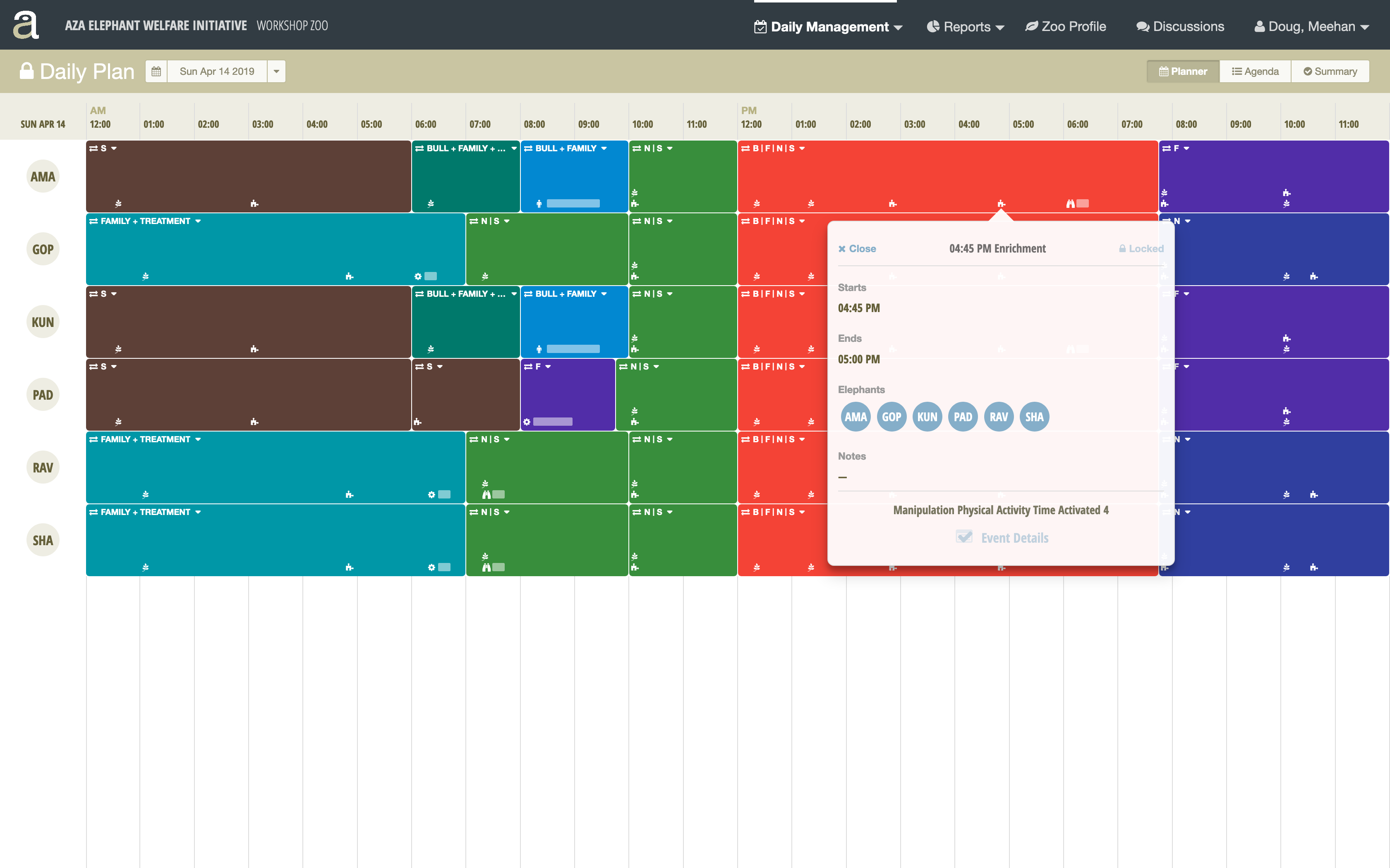
For the Curators we needed an interface that would allow them to visualize the entire 24 hour span of the day and to plan out the housing and event details for that day.
One of the Aware employees is both a data scientist and an artist, so he proposed the idea of "painting" the available time slots with color coded housing options. We decided to pursue this direction and hypothesized that the bright colors and the challenge of filling in all of the available time slots with blocks would provide a strong at-a-glance visualization of the daily plan, clearly articulate the social groupings of the elephants within housing options, as well as encourage the user to complete the plan. By clicking on available time slots and inserting color coded "blocks" of time assigned to social groups of elephants, the user is able to "build" their housing schedule until the entire calendar is accounted for.

Once the housing schedule is determined, the Curator can click into time slots within the housing option to add events of varied length, including feeding, enrichment, husbandry, vetrinary care, data logging, and behavior observations.
Summary, Review, & Submit
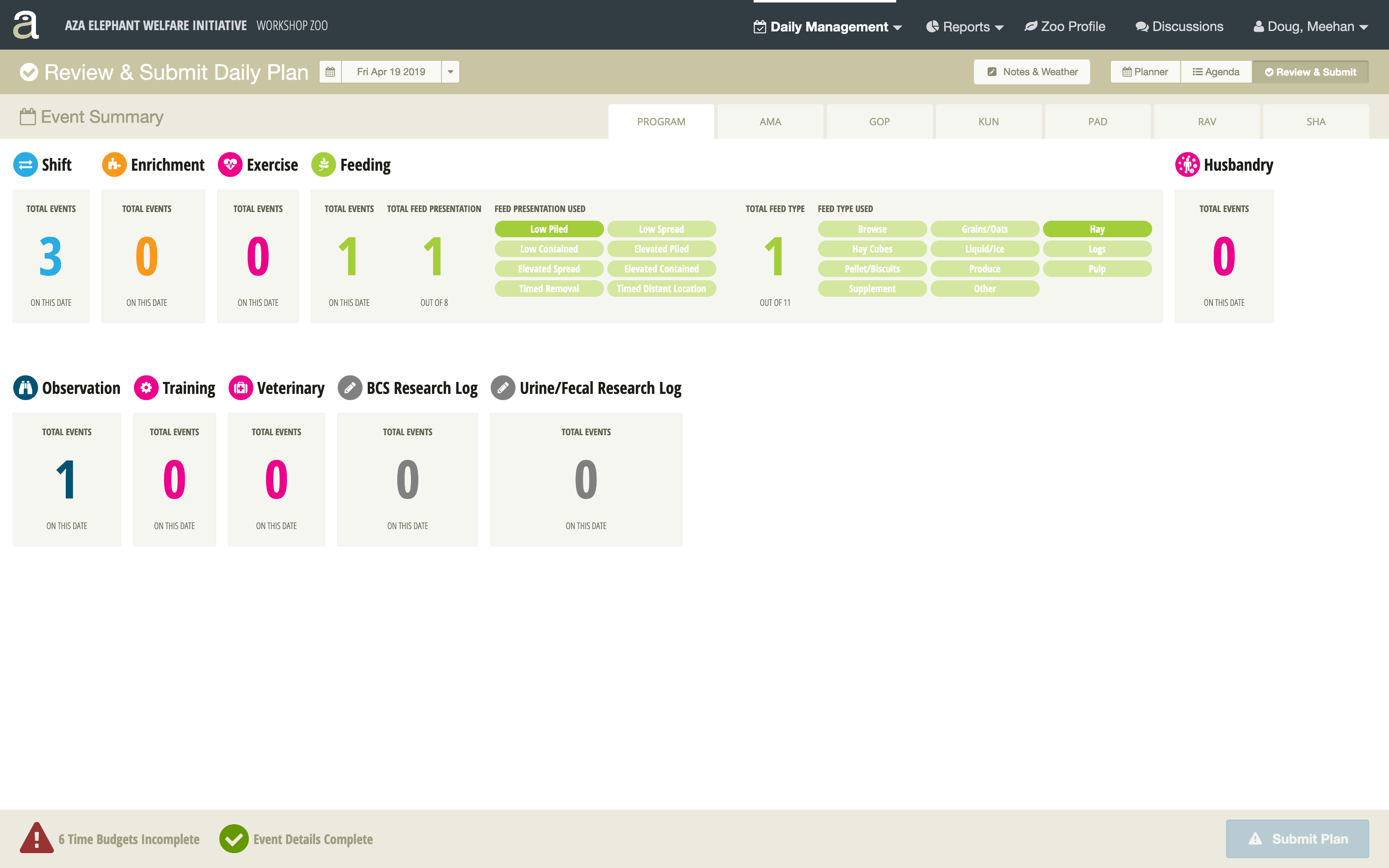
While the Curator is building the daily plan, they can switch over to the "Review & Submit" tab to get a different at-a-glance view of the progress. This view doubles as a validation check to make sure that the team has completed the housing assigmnents and logged the necessary data for each event on the schedule. When the daily plan has been completed, the Curator can submit the completed plan, at which point the data is locked and calculated against a series of metrics.
Agenda
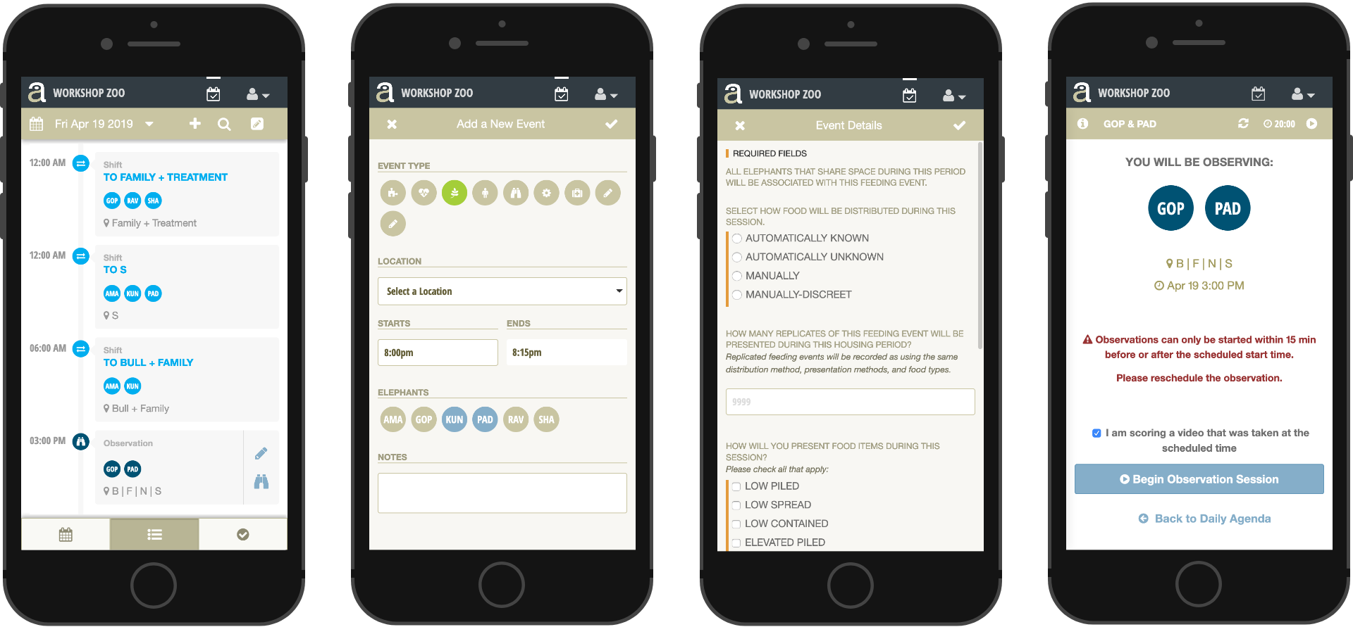
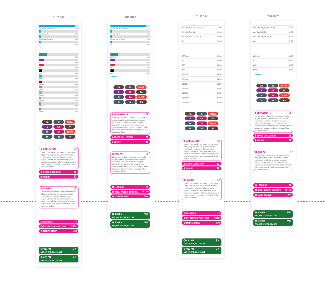
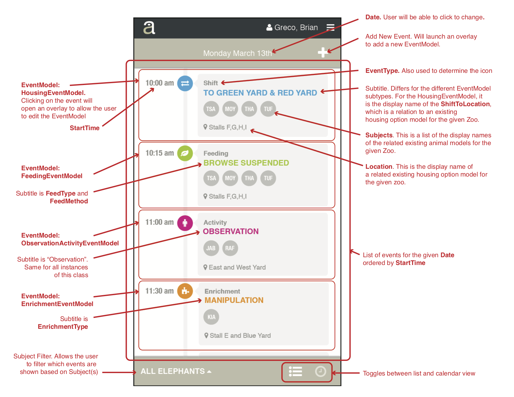
While the Curator creates the daily plan at the beginning of the week or the day before, the Zoo Keepers implement the plan on the day of. This means that are traveling throughout the exhibit, moving the animals, performing tasks, and enriching the environment. For this use case, we developed the Agenda view. The agenda view is optimized for the updating of events in the field as the Zoo Keepers complete them. We created a timeline based interface optimized for the mobile phone, where the Zoo Keepers can update and edit events, enter details about the events as they complete them, and launch the observation tool for behavior observations.
Reports & Data Visualization
Daily Report
Once the daily plan has been completed and submitted, the system processes the data against a series of scientifically determined metrics. Our next task was to design a set of report interfaces to display these metrics.
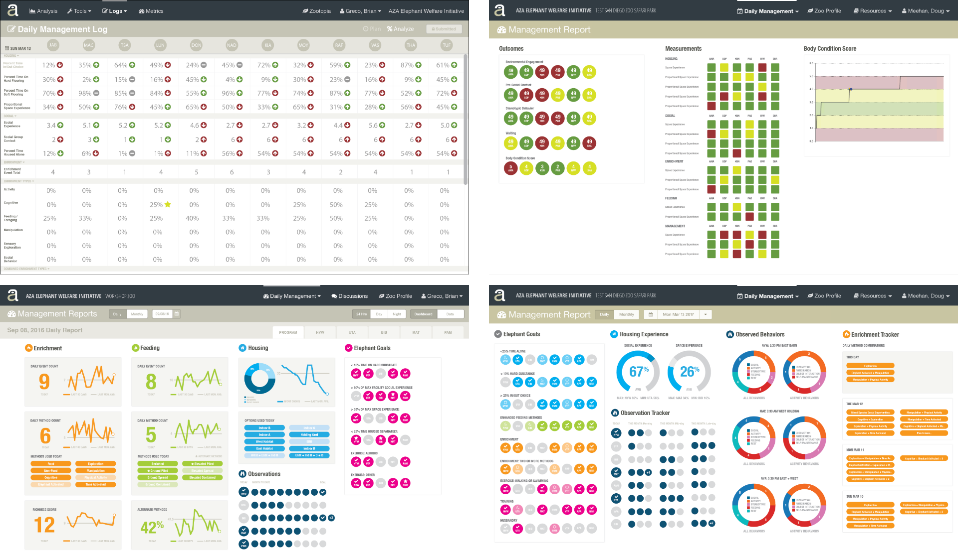
We started off with a very data-heavy interface, with indicators to show daily changes and progress within a series of categories. Feedback from stakeholders and potential users led us to iterate toward a more "dashboard" type of display. The goal of the daily report is to lead the Curator toward creating daily plans that are more complex and meet certain goals and metrics, so we wanted it to present immediate feedback that could be easily digested and understood.
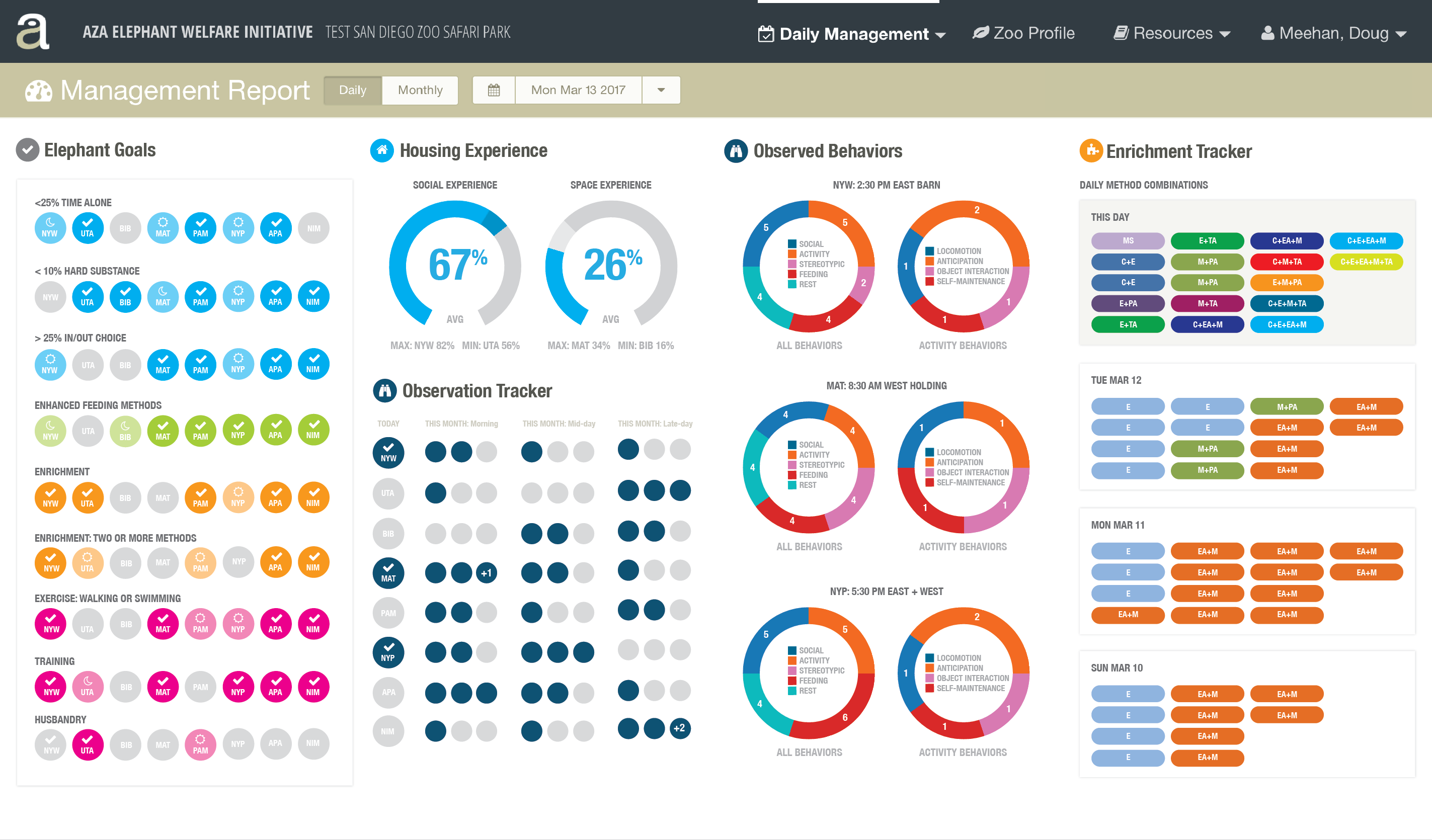
We landed on an approach that extended the gamification concept from the planning interface, with a series of bubbles that the user is trying to "light up" or fill (Elephant Goals), gauges that they are trying to move past a certain goal (Space and Social Experience metrics), and sets of badges that they are trying to make more varied and complex (Enrichment combinations).
Weekly Report
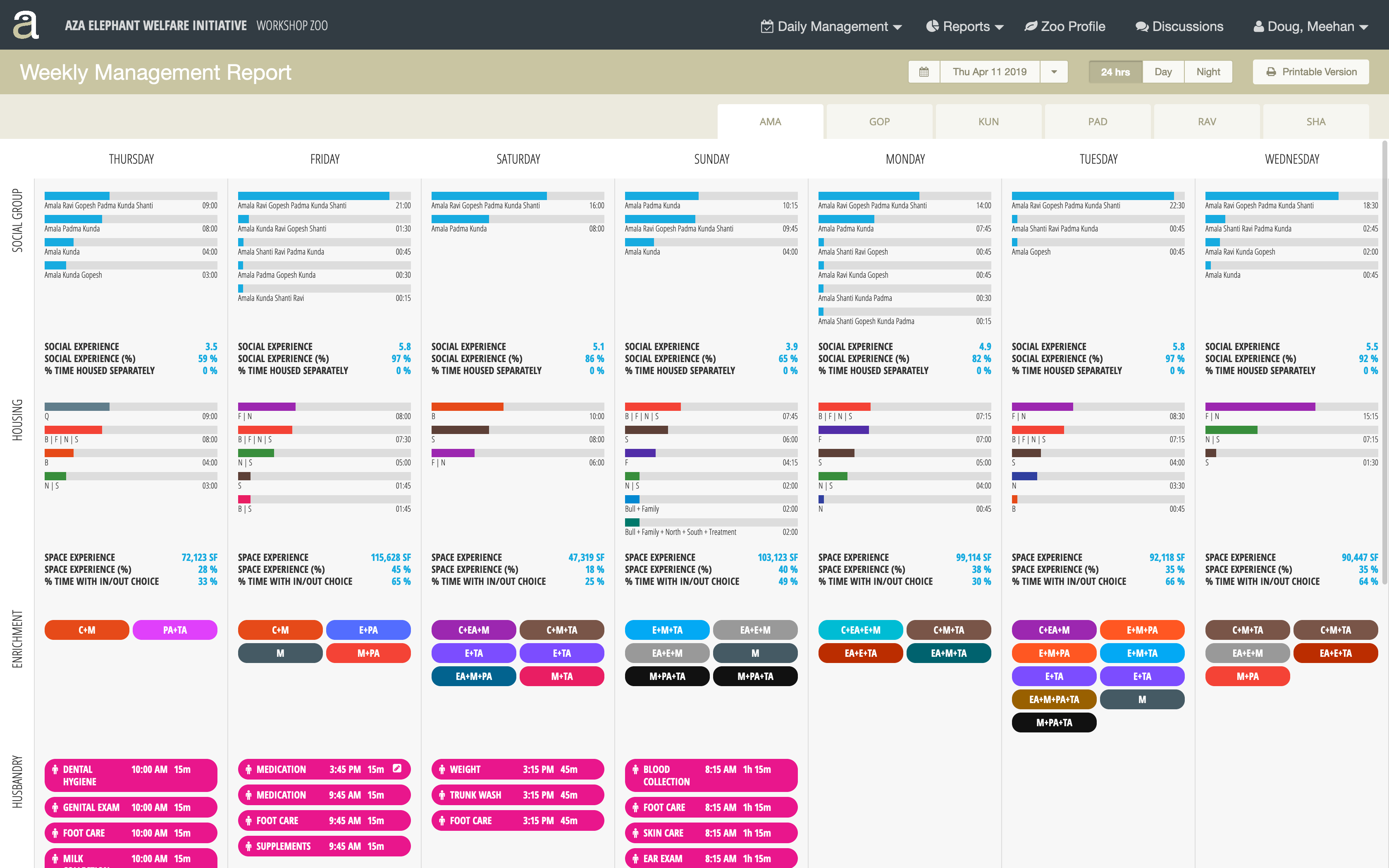
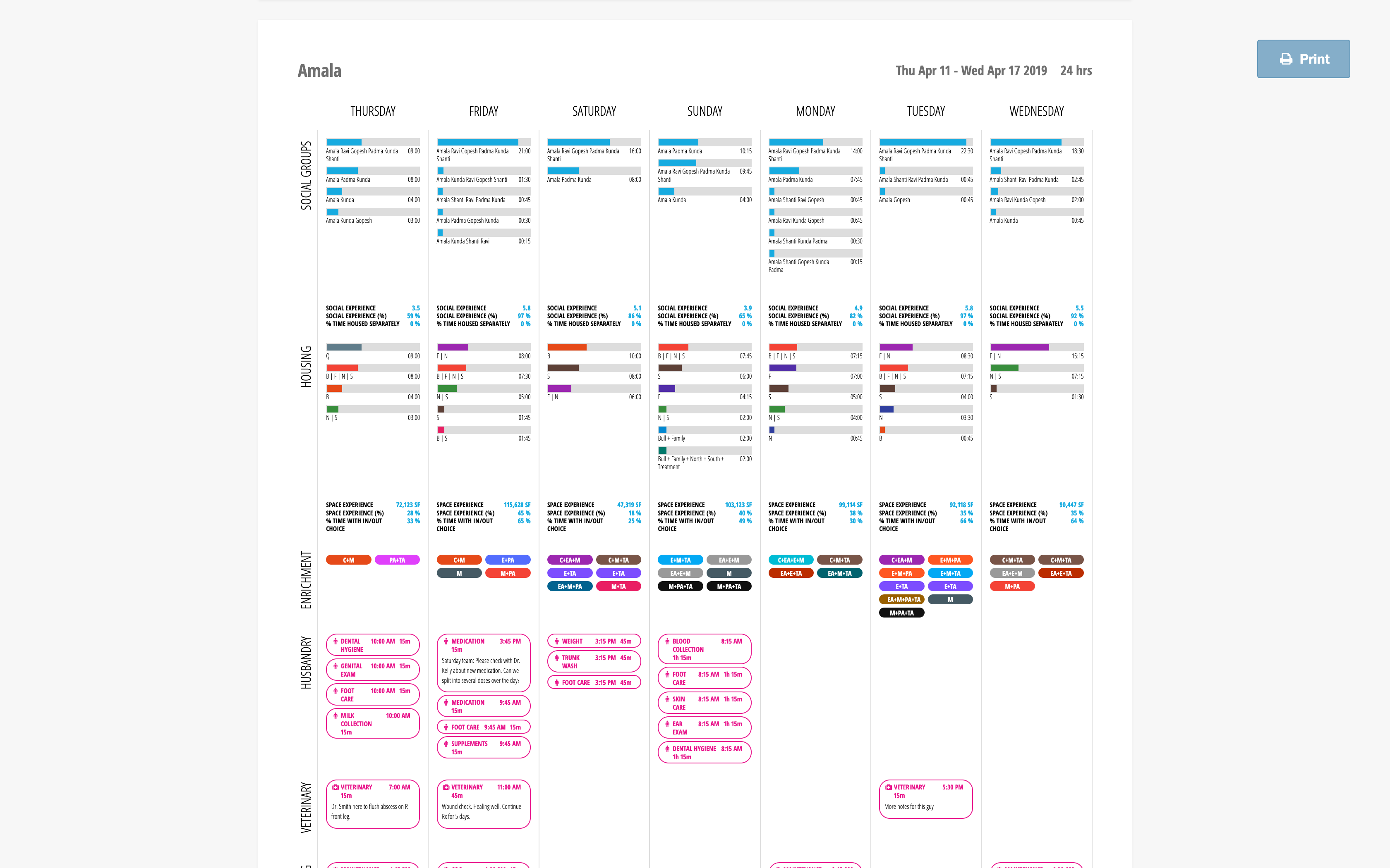
For both our Curator and our Director users, we need to create a report that would allow them to compare daily plans across a week long time period. We quickly settled on a grid view that compared different categories of data across each day of the week. We then studied different options for laying out the columns as well as different approaches to displaying the data widgets.

We settled on a grid with the data categories on the y-axis and the days of the week on the x-axis. This provided the user with the best layout for comparing across days by category, and allowed for variation in content length to scroll vertically if necessary. I created a series of test mockups to further study different methods of displaying data, as well as how to best deal with variations in content length between zoos with different numbers of elephants and housing options.
We incorporated the outcome of these studies into our final design of the weekly report, which also included a printable version that is suitable for submission to our Inspector users.
Monthly Report
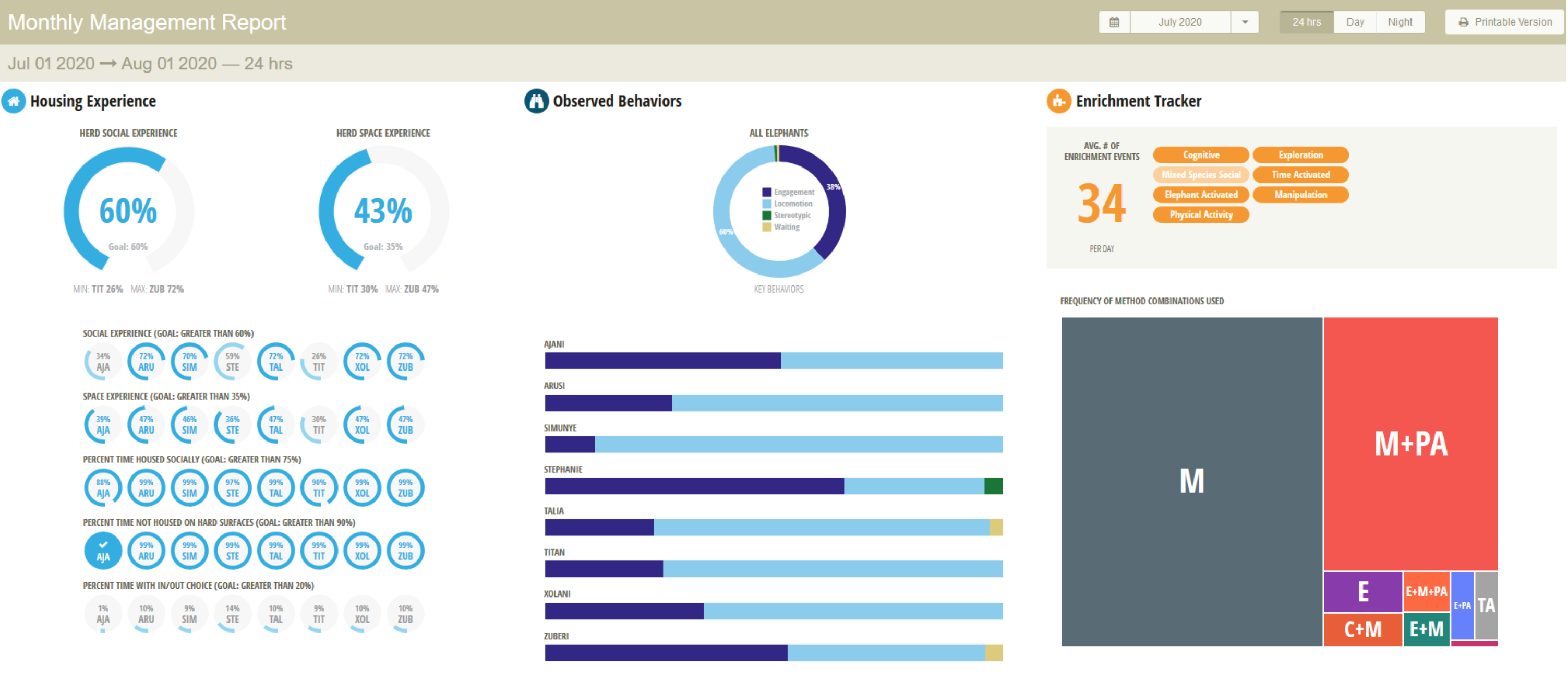
The monthly report was developed for our Curator, Director, and Inspector users. It consists of a roll-up of the daily report across a month timeframe. The Housing Experience section shows the Social and Space experience for the herd. In addition, for each individual elephant, we introduced a variation on the bubble widget to show whether they reached their overall housing goal, but also a percentage of days within the month that each elephant reached their daily goals. The Behvavior Observation data shows the percentage of negative stereotypic behaviors recorded for the month and features a flattened bar chart to better compare the data across the elephant population so that users can identify and address longer-term behavioral problems. Finally, we introduced a Tree Map visualization of the Enrichment Combination across the month to indicate diversity of combinations and whether certain combinations were being overused. The report is also available in a printable version for submission to Inspectors
Implementation
Once the mockups of the design were completed and approved, I moved into the implementation phase where I transformed the designs into fully functional HTML/CSS/Javascript interfaces. I worked closed with backend developers to help them understand what data was needed for the interfaces and in which formats. This included some work building view models and creating controller functions with dummy data to be filled in by the backend developers who were developing the calculations for the different metrics.
Outcome
The application is currently used by twenty zoos and research institutions including San Diego Zoo Global, Oregon Zoo, Saint Louis Zoo, Kansas City Zoo, Sedgwick County Zoo, Cincinnati Zoo, Zoo de Granby, Louisville Zoological Garden, Dickerson Park Zoo, Roger Williams Park Zoo, Buffalo Zoo, Cameron Park Zoo, El Paso Zoo, Fresno Chaffee Zoo, Milwaukee County Zoological Gardens, Point Defiance Zoo & Aquarium, Riverbanks Zoo & Garden, Santa Barbara Zoological Gardens, Zoo Atlanta, and Caldwell Zoo.
These zoos have been able to use the software to implement new best-practices for the care of their animals and are seeing measurable improvements in their welfare. For example, after only a few months of using the interface, the team at Cincinnati Zoo & Botanical Garden identified a need for and devised a plan to improve the space and social experience for all elephants. More inside–outside choice is provided, and female elephants are more regularly housed together overnight in larger, connected spaces. As a result, overnight social experience for the herd increased 6%, daytime inside–outside choice for the male increased 14% and night-time space experience increased 29% for two females who were more often provided overnight access to a large outdoor habitat.